Why One Men’s Football Jersey Feels Like Teamwear—and Another Lands Like Streetwear
Meta description: A deep look at the fit, fabric, graphics, trims, and production decisions that make a men’s football jersey read like streetwear instead of standard teamwear.
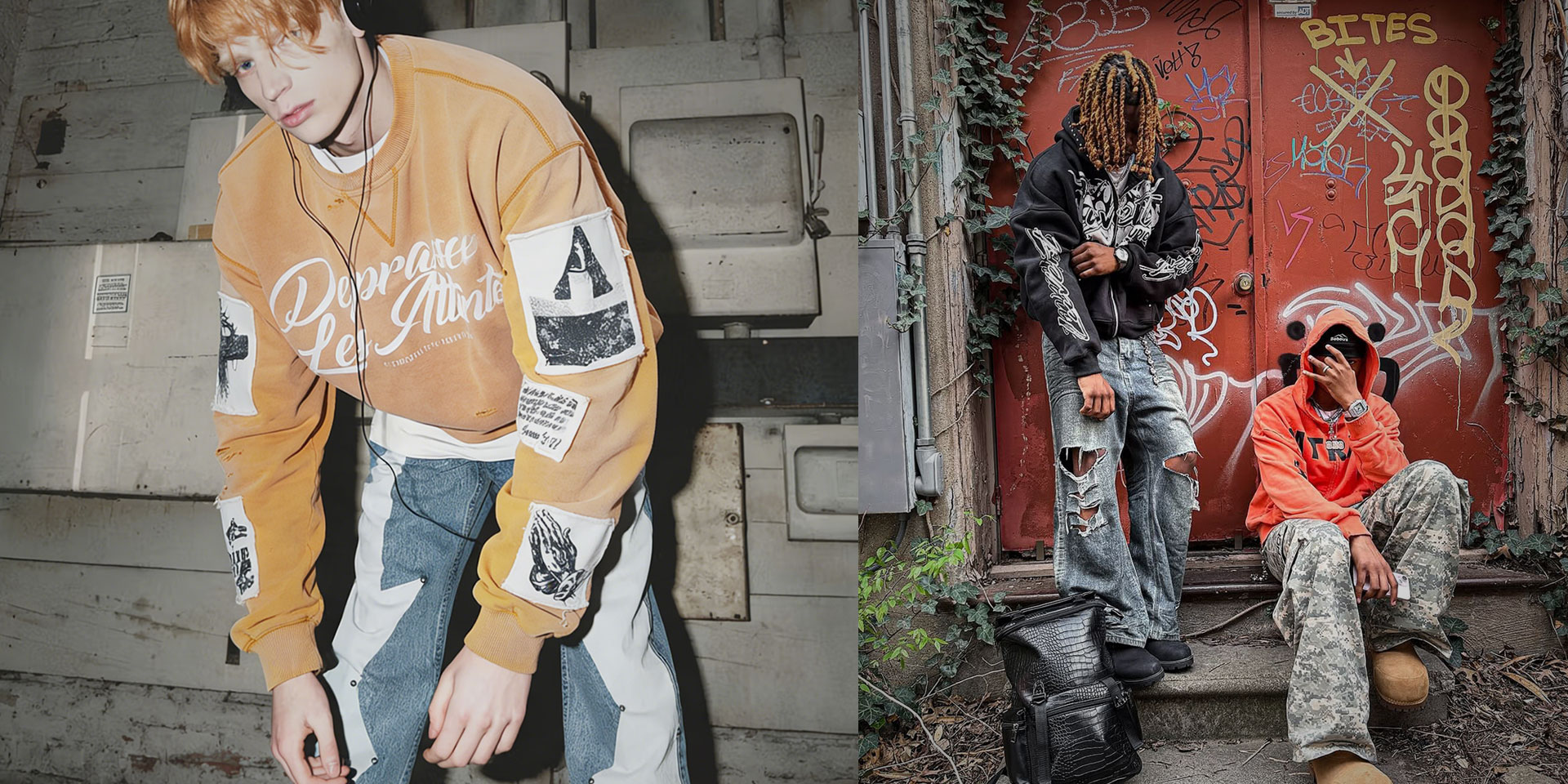
There was a time when a football jersey mostly lived in one lane. It belonged to the pitch, the terrace, the team store, or the pub on match day. That lane is gone. A men’s football jersey now shows up with washed denim, wide trousers, layered hoodies, leather jackets, and even tailored outerwear. The category has moved deeper into fashion culture, and recent style coverage has only made that crossover more visible. But the hard part is this: not every jersey makes that jump. Some still read like pure teamwear the second you see them.
Many brand teams find that out later than they expect. On paper, a football jersey looks simple enough—light fabric, panel lines, badge placement, sponsor-style graphics, maybe a retro collar. In real product development, though, it sits right in the overlap of sport, nostalgia, streetwear identity, and production discipline. For established streetwear brands, product development teams, and sourcing teams, the real question is not whether a jersey can be made. The real question is whether it can land like a streetwear piece once it is on body, on camera, and in a full drop.
Why do some football jerseys still read like kit-room product even when the artwork looks strong?
A men’s football jersey feels like streetwear when the whole product shifts from performance logic to identity logic. If the garment is still built around team function, athletic fit, and sponsor hierarchy, better artwork alone will not save it. Streetwear starts when silhouette, handfeel, trim, and styling intent all tell the same story.
That is the first thing many teams get wrong. They treat the jersey like a graphic project when it is really a product-language project. A standard teamwear jersey is designed to serve recognition, movement, and club structure. The front chest, sleeve spaces, number zones, and trim choices usually follow a familiar sports hierarchy. Even when the colors are sharp, the garment still feels like something meant to be worn for the game or for fan loyalty.
Streetwear changes that priority stack. The jersey is no longer there just to represent a side. It has to hold up as a styling piece. It has to feel right with cargos, baggy denim, stacked pants, workwear jackets, or layered thermals. It has to work in editorial photos, close-up product shots, and real everyday wear. That means the garment needs more than references to football culture. It needs a different point of view.
The best football-inspired streetwear pieces usually do one thing very well: they stop looking like merch. They keep the energy of the sport, but they reframe the garment around visual identity, proportion, and attitude. That is why two jerseys with similar colors or similar graphics can land in totally different ways. One looks like team apparel. The other looks like part of a curated drop.
Which silhouette changes actually push a men’s football jersey into streetwear territory?
Silhouette is usually the biggest shift. A streetwear jersey tends to feel boxier, more deliberate, and more balanced for off-pitch styling, while teamwear usually stays closer to an athletic block. The key is not making the jersey simply bigger. The key is changing proportion in a way that creates shape, drape, and presence.
This is where experienced pattern development matters. A lot of jerseys fail because the fit has been upsized, not redesigned. That difference is huge. When a teamwear base is just graded up, the body often gets longer without getting better. The shoulders may sit awkwardly, the sleeve opening can lose structure, and the side silhouette ends up feeling sloppy instead of intentional.
Streetwear fit usually needs a stronger plan. That may mean a boxier torso, a slightly dropped shoulder, more room at the chest, and sleeves that feel fuller without looking limp. Sometimes it means a cropped body with wider balance. Sometimes it means a longer, more relaxed vintage football proportion. The answer depends on the brand direction, but the point is the same: the shape has to feel designed, not accidentally oversized.
A good streetwear jersey also needs to think about what happens when it is layered. Can it sit cleanly over a thermal or under an overshirt? Does the collar hold its shape under a jacket? Does the hem land well with wider pants? These are not styling afterthoughts. They are pattern questions.
The strongest product teams usually test the jersey on body early, not just on a hanger. A flat sketch cannot tell you if the shoulder line falls too far, if the armhole is collapsing, or if the torso is reading sports-store rather than street. On this category, fit is not a technical detail. Fit is the message.
How do fabric handfeel and finish change the read before anyone notices the graphics?
Fabric often decides the mood before the eye even registers the badge or print. Streetwear jerseys usually feel more tactile, more matte, more textured, or more substantial than standard teamwear. When the fabric feels too slick, too shiny, or too purely performance-driven, the piece usually slides back toward classic sport apparel.
That does not mean every streetwear jersey has to abandon technical fabric. It means the fabric needs the right visual and tactile behavior. A matte interlock, denser mesh, textured jacquard, open-hole mesh with body, or a cotton-rich blend can all push the piece closer to streetwear, depending on the design direction. The key is how the fabric holds shape, catches light, and supports the graphic language.
This matters because football-inspired streetwear is often bought with the eyes first and judged with the hands second. If the surface feels flat and synthetic in a generic way, the jersey can lose depth fast. If it has texture, softness, subtle weight, or a slightly dry handfeel, it usually feels more premium and more styled.
Finish also changes everything. A retro-inspired jersey may need a washed feel, softened collar, faded print edge, or less aggressive shine to feel lived-in rather than factory-fresh. A more futuristic version may go the other way and use sharp panel contrast, engineered knit texture, or a cleaner technical hand. Either way, the finish must match the concept.
This is also where factories can get into trouble. A fabric that looks right on a swatch may behave differently once it is sublimated, cut, sewn, pressed, and worn. Mesh openness can change the drape. Rib recovery can change the collar attitude. Heat-applied details can alter the handfeel. If fabric sourcing, trim selection, and print testing are treated as separate decisions, the jersey often loses the exact feeling the brand was aiming for.
What separates a streetwear graphic layout from a teamwear graphic layout?
A streetwear jersey graphic works when it feels edited, intentional, and tied to the brand’s visual identity—not when it simply copies the logic of club sponsorship. The difference usually comes down to hierarchy, spacing, placement, and restraint. Streetwear does not need less graphic energy, but it does need better control.
This is where many otherwise solid jerseys go sideways. A teamwear layout usually follows a fixed system: badge, sponsor, performance logo, back number, sleeve marks. That structure is built for recognition. Streetwear can quote that structure, but it should not feel trapped by it.
The strongest jerseys in this space usually remix football language rather than reproduce it literally. A chest graphic may echo sponsor placement without behaving like a sponsor. A back number may work more like a storytelling device. A crest may be replaced with a custom patch, tonal embroidery, or a deliberately stripped-back badge. Sometimes the smartest move is leaving more negative space so one element can actually hit harder.
Three questions usually tell you whether the layout is landing:
1.What does the eye hit first? If everything is screaming at the same volume, the jersey often reads generic.
2.Does the front-to-back story feel connected? A strong back print cannot rescue a confused front chest.
3.Would the graphic still make sense if the jersey is layered under outerwear? Streetwear pieces have to work in real styling, not only in flat product photos.
Technique choice matters too. Screen print can feel bolder and more tactile than a standard transfer. Flock can add a retro football mood. Satin stitch embroidery can sharpen a patch without making it feel stiff. Sublimation can work, but when it is used without texture or design discipline, it often looks too close to mass teamwear. The point is not that one method is always better. The point is that decoration has to support the product identity, not fight it.
Why do collars, panels, and trims decide whether the jersey feels collectible or generic?
Small construction details are often what make the garment feel designed. On a football jersey, collar shape, rib depth, tipping, panel balance, piping, seam mapping, and badge execution do more than decorate the piece. They decide whether the product feels close to fashion or close to standard athletic issue.
A retro collar is a good example. On the right jersey, it changes the entire tone of the garment. A contrast placket, slightly deeper rib, or cleaner point shape can pull the piece toward terrace culture, Y2K sports nostalgia, or luxury-adjacent streetwear. On the wrong base, though, the same collar can look costume-like or flimsy.
Panel construction matters in the same way. A jersey with thoughtful cut-and-sew lines can feel engineered and directional. One with random contrast panels often feels busy with no real payoff. Good panel work supports movement, shape, and visual flow. It frames the chest correctly, helps sleeve proportion, and gives the garment rhythm. Weak panel work just adds noise.
Then there are the details people notice up close. Is the badge woven, embroidered, heat-applied, or printed? Does the neck tape feel intentional or generic? Are the side seams clean? Does the hem finish feel sharp enough for retail presentation? Streetwear is a close-range category now. Social content, detail shots, and customer unboxings expose weak finishing immediately.
That is why a general sportswear factory can technically make a jersey and still miss the point. The piece may be clean enough by basic standards, but the trim logic, collar attitude, or detail sharpness may still feel too ordinary. In this category, the last ten percent of construction often creates most of the product’s cultural value.
Where do brands usually lose the streetwear feel between sampling and bulk production?
Most jerseys lose their edge in the middle of development, not at the sketch stage. The usual breakdown happens when fit corrections, fabric substitutions, trim changes, print placement shifts, and finishing decisions are handled in isolation. A football jersey that felt sharp in concept can go flat very quickly once those details start moving.
This is why disciplined development matters more than hype. The jersey may begin with a strong reference board and a clean tech pack, but the real test starts when the product moves through pattern development, fabric and trim sourcing, sampling, fitting, decoration tests, pre-production approval, bulk cutting, sewing, finishing, and final inspection. Every stage can either protect the intended mood or drain it out.
A few problems show up again and again. The sample collar may feel crisp, but the bulk rib behaves differently. The chest placement may be centered in the mockup, but it sits too high once the garment is worn. The mesh body may look premium in the original sample, but a replacement fabric loses the dry hand and changes the drape. Sleeve panels may shift slightly in cutting, and suddenly the shape reads more sports uniform than fashion piece.
This is also where experienced product teams ask better questions. They do not just approve the first sample because the idea looks right. They ask whether the actual fabric lot is locked, whether the badge application has been tested on the final surface, whether the collar stands up after pressing, and whether the fit still works once sizes are graded. On a football jersey, those questions are not extra caution. They are part of getting the product right.
Brands that handle this category well usually understand one thing: a streetwear jersey is not finished when it looks good in one sample size. It is finished when the same attitude survives production realities.
How should sourcing teams judge whether a factory can build a football jersey for streetwear, not just for sport?
The right factory for this category is not just one that can sew jerseys. It is one that understands shape, trim, decoration, and off-pitch product language at the same time. Strong teams ask better questions early, show category-specific references, and treat football jerseys as fashion development with sports DNA—not as standard teamwear output.
That evaluation starts with category proof. Has the factory developed football-inspired streetwear before, or are they mainly showing standard performance jerseys? Can they talk clearly about collar options, badge methods, mesh behavior, print scale, and fit direction? Do they flag risks in the tech pack, or do they only execute what is written? Those answers tell you a lot.
For US, UK, and EU streetwear brands sourcing through China-based production, this is where specialization matters. A factory may be strong in athletic apparel and still not be the best fit for a jersey that needs retro sport references, fashion-led fit, and cleaner retail finishing. Teams comparing options often benefit from looking at a recent roundup of , because the gap between general apparel capability and true streetwear execution is usually wider than it looks on a website.
In the China-based segment, companies such as Groovecolor are often brought into these conversations when brands want a football-inspired piece to feel closer to custom streetwear than standard team kit, especially when fit, decoration, and finishing need tighter development control. That does not mean one factory is right for every brand. It means this product category usually rewards specialization. For collections where the jersey sits next to washed hoodies, mesh shorts, or cut-and-sew outerwear, some teams also prefer speaking with a specialized manufacturer for custom streetwear rather than treating the jersey as a standalone sport item.
The best sourcing conversations sound specific. They get into neckline shape, panel balance, rib recovery, wash or press behavior, print handfeel, and how the jersey will be styled by the end customer. If the discussion stays too generic, the product usually does too.
A men’s football jersey starts reading like streetwear the moment the brand stops treating it like a simple sport replica and starts building it like a fashion object with football memory inside it. That shift shows up in the fit, in the fabric, in the way the collar sits, in the spacing of the graphics, and in whether the garment feels right off the pitch.
That is why this category keeps getting more interesting. It sits between sport history and modern product language, between nostalgia and retail reality, between what looks easy in a moodboard and what actually works in production. The brands that get it right are usually the ones that understand the jersey is not just a reference piece. It is a real streetwear product, and it has to earn that status at every stage of development.
Why "Just Print It" Fails: Which Print Method Actually Survives Bulk Streetwear T-Shirt Production?
On paper, printing a graphic on a heavyweight tee sounds like the easiest part of a collection. Many product teams hand over a tech pack, approve a perfect digital mockup, and assume the factory will just "figure it out." But when the bulk order arrives, the reality hits hard: plastisol prints feel like heavy plastic shields, DTG graphics fade after two washes, and puff prints crack before they even hit the retail floor. The surface appearance of a sample might look incredible, but execution at scale is a completely different discipline. The gap between what a graphic looks like on a screen and how it actually sits on a 300gsm cotton shirt is where many brands lose control of their product identity.
For independent brands with real traction, the decision of which print method to use isn't just about colors—it's about how the garment sits on the body, how it ages, and whether the factory can replicate that exact aesthetic across thousands of units. A specialized streetwear clothing manufacturer understands that a vintage fade requires discharge ink, while a hyper-detailed Y2K graphic demands a completely different approach. This breakdown explores why certain print methods fail at scale and how established labels choose the right technique for bulk production.
Why Does the Choice of Print Method Make or Break a Streetwear Collection?
The choice of print method dictates the garment's hand-feel, drape, durability, and visual identity. In premium streetwear, using the wrong technique—like heavy plastisol on a vintage wash—ruins the silhouette and aesthetic. The right method ensures that the approved sample translates accurately into bulk production, survives washing, and stays aligned with the brand's cultural language.
A graphic tee in the streetwear space is never just a surface with a logo slapped on it. The way ink interacts with the fabric fundamentally alters the structure of the garment. If a design team specifies a boxy, oversized fit using a premium heavyweight cotton, applying a massive, thick plastisol print across the chest will completely stiffen the fabric. The shirt will no longer drape naturally; instead, it will fold awkwardly around the heavy ink layer. This is a common sourcing mistake where the aesthetic intent clashes with the production reality.
Furthermore, consumers today are hyper-aware of texture and aging. They might not know the technical difference between water-based and discharge printing, but they instantly recognize when a shirt feels rubbery, stiff, or uncomfortable. A streetwear brand’s visual identity is heavily tied to how its products feel out of the box and how they evolve after ten washes. A manufacturer that treats every graphic with a generic, one-size-fits-all printing approach will inevitably deliver a product that lacks the depth and nuance expected in modern streetwear. The print method must be treated as a structural component of the garment, not just a surface decoration.
Is Screen Printing Still the Best Option for Bulk Streetwear Tees?
Yes, screen printing remains the industry standard for bulk streetwear T-shirt production due to its unmatched durability, vibrant color payoff, and scalability. Unlike digital methods, it supports specialty techniques like puff, high-density, and discharge inks, making it essential for brands requiring complex, texture-driven graphics at high volumes.
When discussing bulk production, screen printing is rarely challenged as the dominant method. Its efficiency at scale and ability to withstand aggressive washing make it the backbone of the industry. However, simply requesting "screen printing" from a factory is not enough. Screen printing is a broad category, and the execution depends entirely on the ink formulation, the mesh count of the screens, the curing temperature, and the skill of the operator.
For established streetwear brands, the conversation isn't about whether to use screen printing, but rather how to manipulate the process to achieve a specific vibe. A standard apparel factory might default to standard plastisol because it is easy to work with, cures quickly, and requires less precision. A specialized streetwear factory, however, will ask questions about the desired hand-feel, the fabric composition, and the intended aging process of the garment. They understand that screen printing is a highly adaptable medium that can be tuned to produce everything from a razor-sharp, glossy logo to a soft, faded vintage graphic that feels indistinguishable from the fabric itself.
Plastisol vs. Water-Based vs. Discharge: Which Ink Works Best for Your Aesthetic?
Plastisol offers maximum opacity and durability but leaves a heavy texture. Water-based inks soak into the fabric for a softer, premium feel, ideal for luxury streetwear. Discharge inks remove the fabric’s dye, creating an authentic vintage, zero-hand-feel finish perfect for retro or faded aesthetics.
Understanding ink types is the most critical step in controlling the final product. Plastisol is the most common ink used globally. It is composed of PVC particles suspended in a plasticizer, meaning it essentially sits on top of the fabric. While it delivers incredible color vibrancy and opacity—even on dark garments—it creates a noticeable layer that can feel heavy and unbreathable, especially on large designs. For bold, solid graphics where a slight gloss or raised texture is acceptable, plastisol is highly effective. However, for oversized prints on premium heavyweight cotton, it can compromise the garment's natural drape.
Water-based inks offer a sophisticated alternative. Instead of sitting on the surface, these inks penetrate the fibers of the shirt. The result is a significantly softer hand-feel that integrates seamlessly with the fabric. This method is heavily favored by premium streetwear brands aiming for a more elevated, luxury finish. The trade-off is that water-based inks require more expertise to print consistently, especially on dark fabrics, as they can dry quickly on the screens and demand precise curing environments.
Discharge printing takes the water-based concept a step further. It uses a specialized chemical agent to remove the original dye from the garment and replace it with the desired pigment. This creates a true "zero-hand" feel—you literally cannot feel the print when you run your hand over the fabric. Discharge is the ultimate choice for vintage-inspired collections or heavily washed garments where the graphic needs to look integrated and slightly faded from day one. Some , such as , focus specifically on executing complex water-based and discharge printing on heavyweight cotton, ensuring the fabric retains its intended drape rather than feeling stiff and commercial.
Can DTG (Direct-to-Garment) Handle Premium Bulk Production?
While DTG excels at producing hyper-detailed, multi-color, photo-realistic graphics with zero setup cost, it is generally not recommended for premium bulk streetwear production. It often struggles with wash durability, color vibrancy on dark heavyweight fabrics, and replicating the approved sample quality across large runs.
Direct-to-Garment printing has revolutionized the custom apparel space by allowing complex, full-color images to be printed directly onto fabric much like a standard inkjet printer. For highly detailed artwork, gradients, or photographic prints, DTG can achieve results that screen printing simply cannot match without excessive setup costs. It is highly effective for limited drops, highly complex designs, or pre-scale testing.
However, when moving into bulk production for streetwear brands with proven sales, DTG reveals significant limitations. The primary issue is wash durability. Even with advanced pre-treatment processes, DTG prints tend to fade and fibrillate much faster than properly cured screen prints. Additionally, DTG ink struggles to achieve the deep, saturated opacity required for bold streetwear graphics, particularly on dark, heavyweight fabrics. The production speed is also a bottleneck; printing a large volume of shirts via DTG is significantly slower and often more expensive per unit than screen printing. For brands prioritizing long-term durability and a premium tactile experience, DTG is usually reserved for specific, highly detailed capsule pieces rather than the core bulk production strategy.
How Do Specialty Techniques Like Puff and Crack Print Survive Bulk Runs?
Specialty techniques like puff and crack print survive bulk runs only through strict temperature control, precise ink mixing, and fabric compatibility testing. If a factory lacks experience, puff prints will flatten or crack prematurely, and crack prints will peel excessively rather than aging naturally.
Specialty printing is where the distinction between a generic apparel factory and a true becomes painfully obvious. Puff printing, which uses a heat-activated foaming agent mixed with plastisol ink, creates a raised, 3D effect that has become a staple in modern streetwear. However, it is notoriously difficult to control at scale. If the curing temperature is too low, the ink won't puff correctly; if it's too high, the puff will collapse or become brittle. In bulk production, a slight variation in oven temperature or conveyor speed can ruin hundreds of garments, leaving the brand with inconsistent textures.
Similarly, crack printing is designed to look aged and distressed right off the press, but there is a fine line between a controlled vintage crackle and a print that simply flakes off the shirt after one wash. A specialized factory will test the specific ink formulation on the exact heavyweight fabric being used, adjusting the stretch additives to ensure the print cracks visually without compromising the structural integrity of the graphic. This level of technical capability is why independent brands with real traction prioritize manufacturing partners who understand the chemistry behind the aesthetic, rather than just the visual mockup.
What Should Sourcing Teams Verify Before Approving a Bulk Print Run?
Sourcing teams must verify wash test results, ink-to-fabric compatibility, curing temperatures, and strike-off consistency before approving bulk production. Evaluating a manufacturer’s quality control protocols ensures that the 5,000th unit matches the exact texture, color, and hand-feel of the approved pre-production sample.
The transition from an approved sample to a full bulk run is the most vulnerable phase of streetwear production. For procurement teams and product developers, approving a strike-off (a small test print on the actual fabric) is only the first step. The real test is ensuring that the factory's production systems are built to replicate that strike-off thousands of times without degradation in quality.
Before committing to a large order, teams should demand detailed documentation on the curing process and request wash-tested samples. A print might look perfect when it comes off the press, but if it hasn't been properly cured, it will fail in the laundry. Furthermore, it is essential to confirm that the factory will not substitute ink brands or alter the mesh count during bulk production to cut costs or speed up the process. Sourcing teams evaluating an industry comparison of specialized often find that the best partners are those who proactively provide these technical details and highlight potential risks before production begins.
What Makes High-Density and Gel Prints So Difficult to Scale?
High-density and gel prints demand meticulous screen preparation, multiple passes of ink, and exact curing temperatures. If the production environment lacks precision, the sharp edges of the design will blur, and the thick ink layers will peel or crack during bulk runs.
Beyond puff and crack prints, streetwear brands frequently push the boundaries of texture with high-density and gel printing. High-density printing uses a specialized capillary film on the screen to build up thick, sharp layers of plastisol ink. The result is a crisp, architectural block of color that stands noticeably above the fabric surface. It is highly effective for logos and small, bold graphics that require a tactile, premium finish. However, achieving this effect in bulk production is a significant technical challenge.
The process requires multiple passes of ink, with a "flash cure" (partial drying) between each pass. If the screens are not perfectly registered—meaning aligned down to the millimeter—the sharp edges of the high-density print will blur, ruining the clean, architectural look. Furthermore, if the final curing temperature is not perfectly calibrated, the thick layer of ink will not bond properly to the fabric, leading to premature peeling. This is why many product development teams discover that a high-density strike-off looks flawless, but the bulk run suffers from inconsistent thickness and blurred edges. A specialized streetwear factory mitigates this risk by employing automated presses with precise registration controls and rigorous temperature monitoring.
Gel printing, which uses a clear, thick ink to create a glossy, wet look, presents similar challenges. It is often used to add a subtle, tonal branding effect or to highlight specific elements of a larger graphic. Like high-density printing, it requires precise application and curing. If the gel is applied too thinly, the effect is lost; if it is applied too thickly, it can become stiff and uncomfortable to wear. The key to successfully scaling these techniques lies in the manufacturer's ability to deliver uniform results across thousands of garments, ensuring that the 5,000th shirt has the exact same crisp, tactile finish as the approved sample.
Why Does Fabric Weight and Composition Dictate the Print Method?
The weight, weave, and composition of the fabric fundamentally determine which print methods will succeed. Heavyweight cottons require inks that either penetrate deeply or sit flexibly on the surface, while synthetic blends demand low-cure inks to prevent dye migration and scorching.
A critical oversight in many sourcing decisions is treating the print method as an isolated variable, independent of the garment itself. In reality, the fabric is the foundation that dictates what is technically possible. Premium streetwear heavily favors heavyweight cotton—often ranging from 250gsm to 400gsm for tees and hoodies. This dense, tightly woven material interacts with ink very differently than a standard 150gsm promotional t-shirt.
When printing on heavyweight cotton, the primary concern is maintaining the fabric's natural drape and hand-feel. As discussed earlier, applying a large, thick plastisol print to a heavy tee can create an uncomfortable, rigid shield across the chest. This is why water-based and discharge inks are so highly valued in this category; they integrate into the dense fibers without adding unnecessary weight or stiffness. However, if a brand opts for a vintage wash or an acid wash on that heavyweight cotton after printing, the ink must be formulated to withstand the aggressive chemical and abrasive processes of the wash house.
Conversely, if a collection incorporates synthetic fibers—such as a sportswear-inspired jersey or a technical fleece—the printing parameters change entirely. Polyester and nylon blends are prone to "dye migration," a phenomenon where the dye from the fabric bleeds into the ink when exposed to high curing temperatures, turning a crisp white logo into a muddy pink or grey. To prevent this, manufacturers must use specialized low-cure plastisol inks or silicone-based inks that cure at lower temperatures, protecting both the graphic and the synthetic fibers. Understanding these material-specific constraints is a hallmark of an experienced production partner.
What Are the Hidden Costs of Poor Print Execution in Bulk Production?
Poor print execution in bulk production leads to catastrophic hidden costs, including unsellable inventory, delayed launches, damaged brand reputation, and expensive rework. Choosing a cheaper, inexperienced factory often results in higher overall expenses due to inconsistent quality and high defect rates.
When evaluating production quotes, sourcing teams often focus primarily on the per-unit cost of the garment and the print. However, the true cost of a streetwear collection is rarely reflected in the initial invoice. The hidden costs of poor print execution can quickly erode profit margins and derail an entire season's launch calendar.
Consider the scenario where a brand approves a beautifully executed water-based strike-off, but the factory—lacking the necessary expertise or cutting corners to meet a tight deadline—fails to hold the same standard during the bulk run. The result might be thousands of shirts with faded, patchy graphics or ink that washes out after a single laundry cycle. This inventory becomes unsellable at full retail price, forcing the brand into heavy discounting or, worse, writing off the stock entirely.
Furthermore, inconsistent print quality damages a brand's reputation and consumer trust. In the highly competitive streetwear market, consumers are vocal about product quality, and a single poorly executed drop can lead to negative reviews and lost customer loyalty. The cost of replacing defective units, managing customer returns, and scrambling to secure a reliable replacement manufacturer far outweighs the initial savings of choosing a cheaper, less experienced factory. For established streetwear brands, investing in a specialized production partner is not an added expense; it is a critical risk management strategy that protects the integrity of the product and the brand's long-term profitability.
Conclusion: The Manufacturing Partner Makes the Print
Choosing the best print method for bulk streetwear T-shirt production is rarely a simple binary choice between screen printing and DTG. It is a nuanced decision that involves balancing the desired aesthetic, the fabric weight, the wash requirements, and the reality of mass production. Screen printing, with its vast array of ink types like water-based, discharge, and specialty puff formulations, remains the undisputed champion for premium streetwear.
However, the technique itself is only as good as the factory executing it. The difference between a stiff, cracking graphic and a soft, perfectly aged vintage print comes down to the expertise of the production partner. For established streetwear brands, the goal is not merely to find a manufacturer capable of applying ink to cotton, but to collaborate with a partner that treats printing as a critical component of product development, ensuring that the brand's creative vision survives the rigors of bulk production.
 premium streetwear manufacturer streetwear clothing manufacturers Groovecolor OEM streetwear manufacturer streetwear apparel manufacturers